description
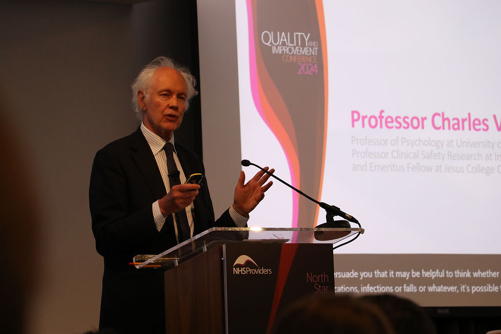
After several years away, the Quality and Improvement Conference returned in 2024 –its first in-person edition since 2019.
The theme, North Star, focused on embedding quality and continuous improvement at the heart of patient care, bringing together industry leaders and experts to explore how ongoing service pressures were shaping care delivery.
The conference branding was developed as a distinct identity, while still retaining recognisable elements from NHSP’s visual language to reflect its heritage. This is expressed through a more mature pink palette, evolving from the organisation’s vibrant fuchsia into deeper tones of burgundy and garnet – creating a more grounded and refined expression while maintaining a clear visual connection to the parent brand.
YEAR
2024
EXPERTISE
Graphic Design
Editorial Design
agency & art direction
NHS Providers
Jim Friedman


I oversaw the application of the conference identity across a wide range of digital materials, ensuring a consistent presence across all channels. This included designing email campaign visuals, creating platform-specific social media assets for LinkedIn and X, and developing animated promotional content.
The Quality and Improvement Showcase provided a platform for trusts to share case studies, best practice, and key learnings, with a focus on embedding quality and continuous improvement across patient care.
My role was to design and curate the showcase banners presented at the conference, highlighting the work of six finalists and their use of systematic improvement approaches to meet organisation-wide priorities and strategic objectives.
The banners were designed as illuminated panels, serving a dual purpose: showcasing finalist projects on one side, and featuring the conference’s graphic branding on the reverse. Positioned throughout the space, they helped define and divide the main corridor, guiding attendees between the conference rooms and the central networking and exhibition area.


Although the event took place over a single day, it still required a printed guide featuring the agenda, as well as information on the showcases, exhibitors, and event partners.
The guide was designed as a practical navigational tool, with a focus on clear hierarchy, typography, and layout – allowing attendees to quickly find and engage with key information throughout the event.


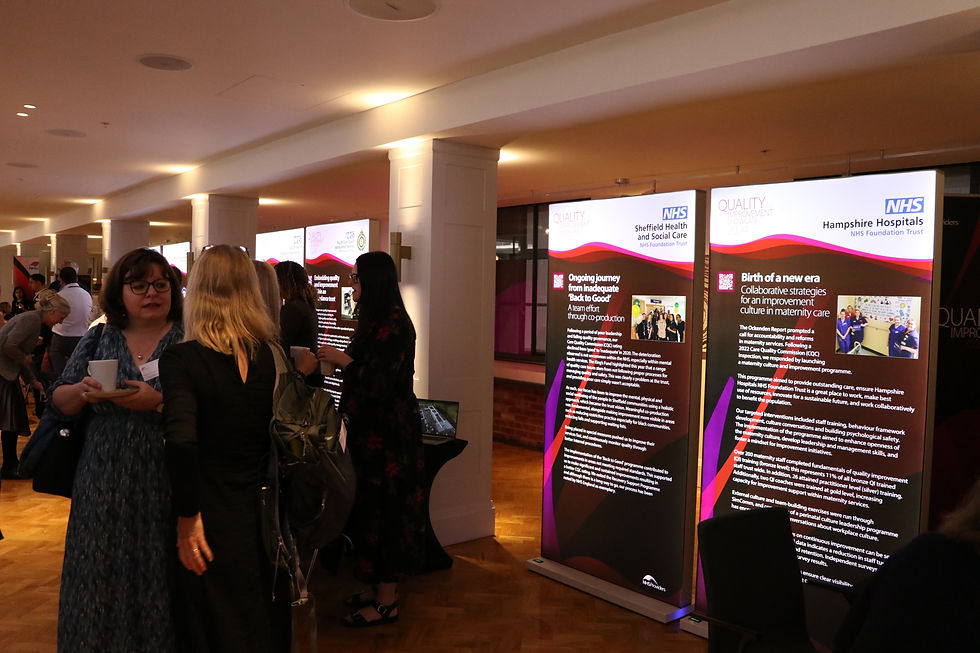
The gallery captures key moments from the conference, including attendees interacting with the illuminated panels, as well as how the different elements of the branding came together across the space to support navigation and create a cohesive event experience.